6.盒子模型、圆角及阴影
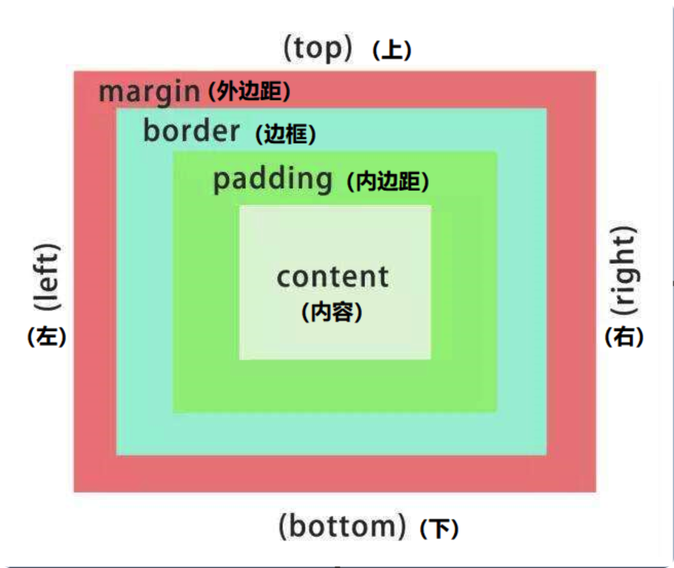
一、 盒子模型
盒子模型: 就是把 HTML 页面中的布局元素看做一个矩形盒子,也就是能装内容的容器。 css 盒子模型本质上时一个盒子,封装周围的 HTML 元素,它包括表框、内边距、外边距 和 实际内容。
注
去除无序列表前的小圆点:list-style: none;
1. 边框(border)
border: 可以设置元素的边框。 边框的大小会影响到盒子的大小
语法:
border: border-width | border-style | border-color;边框参数:
| 属性 | 作用 |
|---|---|
| border-width | 定义边框的粗细,单位是 px |
| border-style | 定义边框的样式 |
| border-color | 定义边框的颜色 |
样式参数:
| 参数 | 效果 |
|---|---|
| none | 没有表框 |
| hidden | 隐藏边框 |
| solid | 实现边框 |
| dashed | 虚线边框 |
| dotted | 点线边框 |
| groove | 3D 沟槽 |
| ridge | 3D 凸起 |
| inset | 3D 嵌入 |
| outset | 3D 起始 |
详情
<!DOCTYPE html>
<html>

<head>
	<meta charset="utf-8">
	<title></title>
	<style type="text/css">
		.bk1, .bk2,.bk3,.bk4,.bk5,.bk6{
			width: 100px;
			height: 30px;
			border-width: 10px;
			margin-top: 20px;
			border-color: green;
		}
		.bk1{border-style: solid;}
		.bk2{border-style: dashed;}
		.bk3{border-style: dotted;}
		.bk4{border-style: groove;}
		.bk5{border-style: ridge;}
		.bk6{border-style: inset;}
		.bk7{border-style: outset;}

	</style>
</head>

<body>
	<div class="bk1"></div>
	<div class="bk2"></div>
	<div class="bk3"></div>
	<div class="bk4"></div>
	<div class="bk5"></div>
	<div class="bk6"></div>
	<div class="bk7"></div>
</body>

</html>
复合写法
语法:
border: 宽度 样式 颜色;详情
<!DOCTYPE html>
<html>

<head>
	<meta charset="utf-8">
	<title></title>
	<style type="text/css">
		.bk1 {
			width: 300px;
			height: 100px;
			border: 10px solid blue;
			border-top-color: red;
		}
	</style>
</head>

<body>
	<div class="bk1"></div>

</body>

</html>
相邻边框合并(border-collapse)
border-collapse: 可以使相邻的两个边框合并在一起
语法:
border-collapse: collapse;详情
<!DOCTYPE html>
<html>
	<head>
		<meta charset="utf-8" />
		<title></title>
		<style type="text/css">
			table {
				margin-top: 10px;
				width: 300px;
				height: 150px;
			}

			td,
			th {
				text-align: center;
				border: 1px solid pink;
			}

			/* 合并相邻的边框 */
			.b1 {
				border-collapse: collapse;
			}
		</style>
	</head>

	<body>
		<table class="b1" cellspacing="0">
			<th>姓名</th>
			<th>年龄</th>
			<th>职业</th>
			<tr>
				<td>刘德华</td>
				<td>18</td>
				<td>演员</td>
			</tr>
			<tr>
				<td>郭富城</td>
				<td>20</td>
				<td>歌手</td>
			</tr>
			<td>张学友</td>
			<td>19</td>
			<td>歌手</td>
		</table>

		<table class="b2" cellspacing="0">
			<th>姓名</th>
			<th>年龄</th>
			<th>职业</th>
			<tr>
				<td>刘德华</td>
				<td>18</td>
				<td>演员</td>
			</tr>
			<tr>
				<td>郭富城</td>
				<td>20</td>
				<td>歌手</td>
			</tr>
			<td>张学友</td>
			<td>19</td>
			<td>歌手</td>
		</table>
	</body>
</html>
2. 内边距(padding)
padding:可以设置内容与边框之间的距离。 内边距也会影响盒子的大小,想要盒子大小不变时,需要先减去两边的内边距。
注意
如果盒子本身没有指定 height 或 width,那么 padding 不会撑开盒子的大小
属性:
| 属性 | 作用 |
|---|---|
| padding-top | 上内边距 |
| padding-right | 右内边距 |
| padding-left | 左内边距 |
| padding-bottom | 下内边距 |
padding 简写
提示
padding 在简写值是,需要遵守 上 - 右 - 下 - 左 的顺序。
| 属性 | 值的个数 | 说明 |
|---|---|---|
| padding: 5px | 1 个值 | 四个内边距都是 5px |
| padding: 5px 10px | 2 个值 | 上下为 5px,左右为 10px |
| padding: 5px 10px 20px | 3 个值 | 上为 5px, 左右为 10px, 下为 5px |
| padding: 5px 10px 15px 20px | 4 个值 | 上为 5px,右为 10px,下为 15px,左为 20px |
详情
<!DOCTYPE html>
<html lang="en">
	<head>
		<meta charset="UTF-8" />
		<meta http-equiv="X-UA-Compatible" content="IE=edge" />
		<meta name="viewport" content="width=device-width, initial-scale=1.0" />
		<title>Document</title>
		<style>
			div {
				width: 100px;
				height: 100px;
				border: 2px solid green;
				margin-top: 10px;
			}
			.d1 {
				padding: 5px;
			}
			.d2 {
				padding: 5px 10px;
			}
			.d3 {
				padding: 5px 10px 15px;
			}
			.d4 {
				padding: 5px 10px 15px 20px;
			}
		</style>
	</head>
	<body>
		<div class="d1">|四个内边距都是5px|</div>
		<div class="d2">上下为 5px,左右为 10px</div>
		<div class="d3">上为 5px, 左右为 10px, 下为5px</div>
		<div class="d4">上为5px,左为10px,下为15px,右为20px</div>
	</body>
</html>
案例一
详情
<!DOCTYPE html>
<html lang="en">
	<head>
		<meta charset="UTF-8" />
		<meta http-equiv="X-UA-Compatible" content="IE=edge" />
		<meta name="viewport" content="width=device-width, initial-scale=1.0" />
		<title>Document</title>
		<style>
			.dchh {
				border-top: 3px solid #ff8500;
				border-bottom: 1px solid #edeef0;
				height: 41px;
				background-color: #fcfcfc;
			}
			.dchh a {
				display: inline-block;
				text-align: center;
				padding: 0 20px;
				line-height: 41px;
				text-decoration: none;
				color: #4c4c4c;
				font-size: 12px;
			}
			.dchh a:hover {
				background-color: #eee;
				color: #ff8500;
			}
		</style>
	</head>
	<body>
		<div class="dchh">
			<a href="#">设为首页</a>
			<a href="#">手机新浪网</a>
			<a href="#">移动客户端</a>
			<a href="#">博客</a>
			<a href="#">微博</a>
			<a href="#">关注我</a>
		</div>
	</body>
</html>
3. 外边距(margin)
margin:用来控制盒子与盒子之间的距离。
提示
margin 的设置方法和 padding 是完全一致的。
1. 清除内外边距
为了防止某些元素自带的内外边距导致布局混乱,一般在网页开始时,同意清除所有元素的内外边距。 为了保证行内元素的兼容性,一般只设置左右的内外边距,转为块元素则不用考虑。
语法:
* {
	margin: 0;
	padding: 0;
}
盒子水平居中
注意
- 要想盒子水平居中,则盒子必须设置了宽度;
- 设置盒子左右的 margin 为
auto即可; - 行内元素或行内块元素需要水平居中时,给他的父元素增加
text-aling: center即可;
详情
<!DOCTYPE html>
<html lang="en">

<head>
	<meta charset="UTF-8">
	<meta http-equiv="X-UA-Compatible" content="IE=edge">
	<meta name="viewport" content="width=device-width, initial-scale=1.0">
	<title>Document</title>
	<style>
		.dchh {
			width: 300px;
			background-color: pink;
			height: 200px;

			margin: 0 auto;
		}
	</style>
</head>

<body>
	<div class="dchh">
	</div>
</body>

</html>
外边距合并(嵌套块元素垂直外边距塌陷)
对于两个嵌套(父子关系)的块元素,父元素有上外边距同时子元素也有上外边距,此时父元素会塌陷较大的外边距值。
外边距塌陷的解决办法:
- 为父元素定义上边框:
border: 1px solid transparent; (透明边框) - 为父元素定义内边距:
padding: 1px; - 为父元素添加属性:<mark>
overflow: hidden;</mark>
详情
<!DOCTYPE html>
<html lang="en">

<head>
	<meta charset="UTF-8">
	<meta http-equiv="X-UA-Compatible" content="IE=edge">
	<meta name="viewport" content="width=device-width, initial-scale=1.0">
	<title>Document</title>
	<style>
		.dchh {
			width: 300px;
			background-color: pink;
			height: 200px;
			margin-top: 20px;
			overflow: hidden;
		}

		.dchh div {
			margin-top: 30px;
			width: 150px;
			height: 150px;
			background-color: green;
		}
	</style>
</head>

<body>
	<div class="dchh">
		<div></div>
	</div>
</body>

</html>
案例一
详情
<!DOCTYPE html>
<html lang="en">

<head>
	<meta charset="UTF-8">
	<meta http-equiv="X-UA-Compatible" content="IE=edge">
	<meta name="viewport" content="width=device-width, initial-scale=1.0">
	<title>Document</title>
	<style>
		* {
			margin: 0;
			padding: 0;
		}

		body {
			background-color: #f5f5f5;
		}

		.bnti {
			font-weight: 400;
			font-size: 18px;
			margin: 20px 160px 5px;
		}

		.jx {
			color: red;
			font-weight: 700;
			margin-left: 140px;
		}

		ul {
			width: 1600px;
			height: 500px;
			margin: 0 auto;
			overflow: hidden;

		}

		li {
			display: inline-block;
			width: 298px;
			height: 415px;
			margin-right: 10px;
			background-color: #fff;
		}

		img {
			width: 100%;
			height: 215px;
		}

		.jpuc {
			font-size: 14px;
			line-height: 1.8em;

			height: 70px;
			padding: 0 28px;
			margin-top: 30px;
		}

		.ldyr {
			font-size: 12px;
			color: #b0b0b0;
			padding: 0 28px;
			margin-top: 20px;
		}

		.mdmd p {
			display: inline-block;
		}

		.name {
			font-size: 14px;
			margin-top: 15px;
			padding: 0 28px;
		}

		.jxge {
			font-size: 16px;
			color: red;
			border-left: 2px solid rgb(217, 216, 218);
			padding-left: 10px;
		}

		a {
			text-decoration: none;
			display: block;
			color: black;
		}
	</style>
</head>

<body>
	<div class="dchh">
		<h3 class="bnti">热评产品</h3>
		<div class="jx">+</div>
		<ul>
			<li class="ip1">
				<a href="#">
					<div><img src="https://img.pupper.cn/img/6651596c01f7dc9c8b51b1acdbbcfbca-2021-11-18.jpeg" alt="">
					</div>
					<p class="jpuc">黑马程序员pink老师前端入门教程,零基础必看的移动端前端视频教程</p>
					<p class="ldyr">来自于 123456677888 的评价</p>
					<div class="mdmd">
						<p class="name">黑马程序员pink老师</p>
						<p class="jxge">99.9元</p>
					</div>
				</a>
			</li>
			<li>
				<a href="#">
					<div><img src="https://img.pupper.cn/img/c2627e804856411944e52485d97936d5-2021-11-18.jpeg" alt="">
					</div>
					<p class="jpuc">黑马程序员pink老师前端入门教程,零基础必看的移动端前端视频教程</p>
					<p class="ldyr">来自于 123456677888 的评价</p>
					<div class="mdmd">
						<p class="name">黑马程序员pink老师</p>
						<p class="jxge">99.9元</p>
					</div>
				</a>
			</li>
			<li>
				<a href="#">
					<div><img src="https://img.pupper.cn/img/da9e1f01a9f9c801404d86dfb7fbe79a-2021-11-18.jpeg" alt="">
					</div>
					<p class="jpuc">黑马程序员pink老师前端入门教程,零基础必看的移动端前端视频教程</p>
					<p class="ldyr">来自于 123456677888 的评价</p>
					<div class="mdmd">
						<p class="name">黑马程序员pink老师</p>
						<p class="jxge">99.9元</p>
					</div>
				</a>
			</li>
			<li>
				<a href="#">
					<div><img src="https://img.pupper.cn/img/e222bc7e43f5db72d00f4f49b925400c-2021-11-18.jpeg" alt="">
					</div>
					<p class="jpuc">黑马程序员pink老师前端入门教程,零基础必看的移动端前端视频教程</p>
					<p class="ldyr">来自于 123456677888 的评价</p>
					<div class="mdmd">
						<p class="name">黑马程序员pink老师</p>
						<p class="jxge">99.9元</p>
					</div>
				</a>

			</li>
		</ul>
	</div>
</body>

</html>
案例二
注
消除无序列表中的小圆点:list-style: none;
详情
<!DOCTYPE html>
<html lang="en">
<head>
	<meta charset="UTF-8">
	<meta http-equiv="X-UA-Compatible" content="IE=edge">
	<meta name="viewport" content="width=device-width, initial-scale=1.0">
	<title>Document</title>
	<style>
		* {
			margin: 0;
			padding: 0;
		}
		.box {
			width: 248px;
			height: 163px;
			border: 1px solid #ccc;
			overflow: hidden;
			margin: 10px auto;
			color: #666;
		}
		.bnti {
			font-weight: normal;
			padding: 0 25px;
			font-size: 14px;
			height: 32px;
			line-height: 32px;
			border-bottom: 1px dotted #ccc;
		}
		.tehv {
			font-size: 12px;
			height: 23px;
			line-height: 23px;
		}
		.tehv a {
			text-decoration: none;
			color: #666;
		}
		.kkbc {
			margin: 7px 0 0 23px;
			list-style: none;
		}

	</style>
</head>
<body>
	<div class="box">
		<h4 class="bnti">品优购快报</h4>
		<ul class="kkbc">
			<li class="tehv"><a href="#">【特惠】爆款耳机5折秒!</a></li>
			<li class="tehv"><a href="#">【特惠】爆款耳机5折秒!</a></li>
			<li class="tehv"><a href="#">【特惠】爆款耳机5折秒!</a></li>
			<li class="tehv"><a href="#">【特惠】爆款耳机5折秒!</a></li>
		</ul>
	</div>

</body>
</html>
二、 圆角及阴影
1. 圆角(border-radius)
border-radius:用于设置边框的圆角
语法:
border-radius: length;注
border-radius 可以分别设置四个角,顺序为 左上(border-top-left-radius) - 右上(border-top-right-radius) - 右下(border-bottom-left-radius) - 左下(border-top-right-radius)
- 如果想要一个圆形,border-radius = 正方形的边的一半 px 或 50% ;
- 如果想要一个矩形圆角,border-radius = 长方形的高的一半 px 或 高的 50%;
简写:
| 写法 | 值的个数 | 含义 |
|---|---|---|
| border-radius: 10px; | 1 个值 | 四个角的弧度都是 10px |
| border-radius: 10px 20px; | 2 个值 | 左上右下=10px,右上左下=20px |
| border-radius: 10px 20px 30px; | 3 个值 | 左上=10px,右上左下=20px,右下=30px |
| border-radius: 10px 20px 30px 40px; | 4 个值 | 四个角分别对应一个值 |
详情
<!DOCTYPE html>
<html lang="en">
<head>
	<meta charset="UTF-8">
	<meta http-equiv="X-UA-Compatible" content="IE=edge">
	<meta name="viewport" content="width=device-width, initial-scale=1.0">
	<title>Document</title>
	<style>
		.box {
			width: 300px;
			height: 300px;
			background-color: pink;
			border-radius: 20px;
		}
	</style>
</head>
<body>
	<div class="box"></div>
</body>
</html>
2. 盒子阴影(box-shadow)
box-shadow:用于设置盒子阴影
语法:
box-shadow: h-shadow v-shadow blur spread color inset;参数;
| 值 | 描述 |
|---|---|
| h-shadow | 必填,水平阴影的位置,允许负值 |
| v-shadow | 必填,垂直阴影的位置,允许负值 |
| blur | 选填,模糊度 |
| spread | 选填,阴影尺寸 |
| color | 选填,阴影颜色 |
| inset | 选填,将外部阴影改为内部阴影(默认为外阴影) |
详情
<!DOCTYPE html>
<html lang="en">
<head>
	<meta charset="UTF-8">
	<meta http-equiv="X-UA-Compatible" content="IE=edge">
	<meta name="viewport" content="width=device-width, initial-scale=1.0">
	<title>Document</title>
	<style>
		.box {
			width: 300px;
			height: 300px;
			background-color: pink;
			border-radius: 20px;
			margin: 50px auto;
		}
		.box {
			box-shadow: 10px 20px 30px #bbb;
		}
	</style>
</head>
<body>
	<div class="box"></div>
</body>
</html>
详情
<!DOCTYPE html>
<html lang="en">
<head>
	<meta charset="UTF-8">
	<meta http-equiv="X-UA-Compatible" content="IE=edge">
	<meta name="viewport" content="width=device-width, initial-scale=1.0">
	<title>Document</title>
	<style>
		.box {
			width: 200px;
			height: 200px;
			background-color: burlywood;

			margin: 100px auto;
			border-radius: 5px;
		}
		.box:hover {
			box-shadow: 0 0 20px #111;
		}
	</style>
</head>
<body>
	<div class="box">鼠标滑过,阴影出现</div>

</body>
</html>
3. 文字阴影(text-shadow)
text-shadow:用于设置文字阴影
语法:
/* 水平阴影位置(必填)、垂直阴影位置(必填)、模糊度、颜色 */

text-shadow: h-shadow v-shadow blur color;
详情
<!DOCTYPE html>
<html lang="en">
<head>
	<meta charset="UTF-8">
	<meta http-equiv="X-UA-Compatible" content="IE=edge">
	<meta name="viewport" content="width=device-width, initial-scale=1.0">
	<title>Document</title>
	<style>
		.box {
			font-size: 30px;
			font-weight: 700;
			color: red;

			text-shadow: 5px 5px 10px #111;
	</style>
</head>
<body>
	<div class="box">你是阴影,我是火影</div>

</body>
</html>